Best mobile website builders in 2026
Jul 13, 2026
/
Auksė Å.
/
17 min Read
The best mobile website builders let you design, publish, and manage a professional website directly from a smartphone or tablet.
Some platforms offer a native mobile app for building from scratch. Others create responsive websites but keep serious design work in a desktop browser. A few sit in the middle, letting you handle day-to-day management efficiently from a phone while reserving layout control for a computer.
Choose based on your workflow: building fully from mobile, managing a site on the go, running an ecommerce store, publishing regular content, or creating a one-page landing page.
Mobile editing quality, responsive template control, AI-assisted setup, and pricing all vary across platforms.
Builder | Best for | Mobile editing approach | AI tools | Starting price (annual billing) | Main limitation |
Hostinger Website Builder | AI-assisted all-in-one | Dedicated mobile editor | AI Website Builder, AI Writer, AI Logo Maker | CA$ 5.59/month | Advanced custom code requires a desktop |
Wix | Mobile design control | Wix app+ dedicated mobile editor | Wix AI Website Builder, AI content tools, logo tools | $17/month; free version available | Heavy customization can slow mobile performance |
Squarespace | Premium responsive templates | Mobile app for content + Fluid Engine browser editor | Blueprint AI setup, AI copy generator | $16/month | Layout design still requires desktop access |
Shopify | Mobile ecommerce management | Shopify mobile app + mobile theme editor | Shopify Magic, Sidekick, and AI Store Builder | $29/month | Not suited for non-store websites |
SimDif | Building a full site entirely from a phone | Native iOS and Android app, same features as desktop | Kai AI assistant and Optimization Assistant | $8.50/month; free version available | Less design flexibility than freeform builders |
Carrd | One-page sites and link-in-bio pages | Browser-based only, no native app | None | $9/year; free version available | No multi-page support, blog, or native ecommerce |
Framer | Design-forward responsive landing pages | Desktop editor only, responsive breakpoint control | Framer AI agent and AI Wireframer workflow | $10/month; free version available | Not practical for phone-first editing |
WordPress.com | Mobile blogging and content publishing | WordPress mobile app | AI writing assistant | $4/month; free version available | Advanced features and plugins require desktop + higher plans |
SITE123 | Quick guided site setup | Browser-based with device preview | Text generation tools | $10.80/month; free version available | Less layout control than drag-and-drop builders |
Weebly | Basic mobile site and store management | The Weebly mobile app was discontinued; editing requires a web browser | None | $13/month; free version available | Platform feels less modern than newer builders |
GoDaddy | Fast local business setup | GoDaddy mobile app + AI-powered section editor | Airo AI setup | $9.99/month | Limited design customization vs. Wix or Squarespace |
What makes a website builder mobile-friendly?
A mobile-friendly website builder does more than produce sites that shrink to fit a small screen. Before choosing one, separate these three related but distinct capabilities.
A responsive website builder automatically adjusts your site’s layout across screen sizes. This helps you make a website mobile-friendly without designing a separate version from scratch.
A mobile website builder app lets you create and edit your site directly from your phone. In contrast, a builder with mobile-specific editing controls gives you separate tools to adjust how the phone version of your site looks, independent of the desktop layout.
Most builders combine two or three of these capabilities, but their strengths differ. Wix pairs responsive templates with strong mobile editing controls, and Squarespace combines responsive templates with mobile content updates and desktop layout editing.SimDif offers identical editing on phone and desktop, while Framer and Carrd produce responsive sites but keep design work in a desktop browser.
Knowing what a website builder is at a foundational level makes these distinctions easier to weigh.
When comparing builders for mobile use, look at:
- Mobile editor or app quality: can you build, edit, publish, or manage important parts of the site from your phone?
- Responsive template library and breakpoint control: does the builder adjust automatically, or can you control the mobile layout directly?
- Mobile preview: can you check the phone version before publishing?
- Touch-friendly navigation: are menus, buttons, forms, and links easy to tap?
- Page speed and Core Web Vitals: does the builder help you keep pages fast after adding images, animation, apps, or scripts?
- Ecommerce management from mobile, if you run a store.
- AI-assisted setup for faster initial launch.
- Pricing transparency: Does the plan clearly show renewal pricing, ecommerce limits, storage, bandwidth, and app costs?
- How much desktop access will you still need for advanced work?
1. Hostinger Website Builder
- Best for: AI-assisted mobile website creation on a budget.
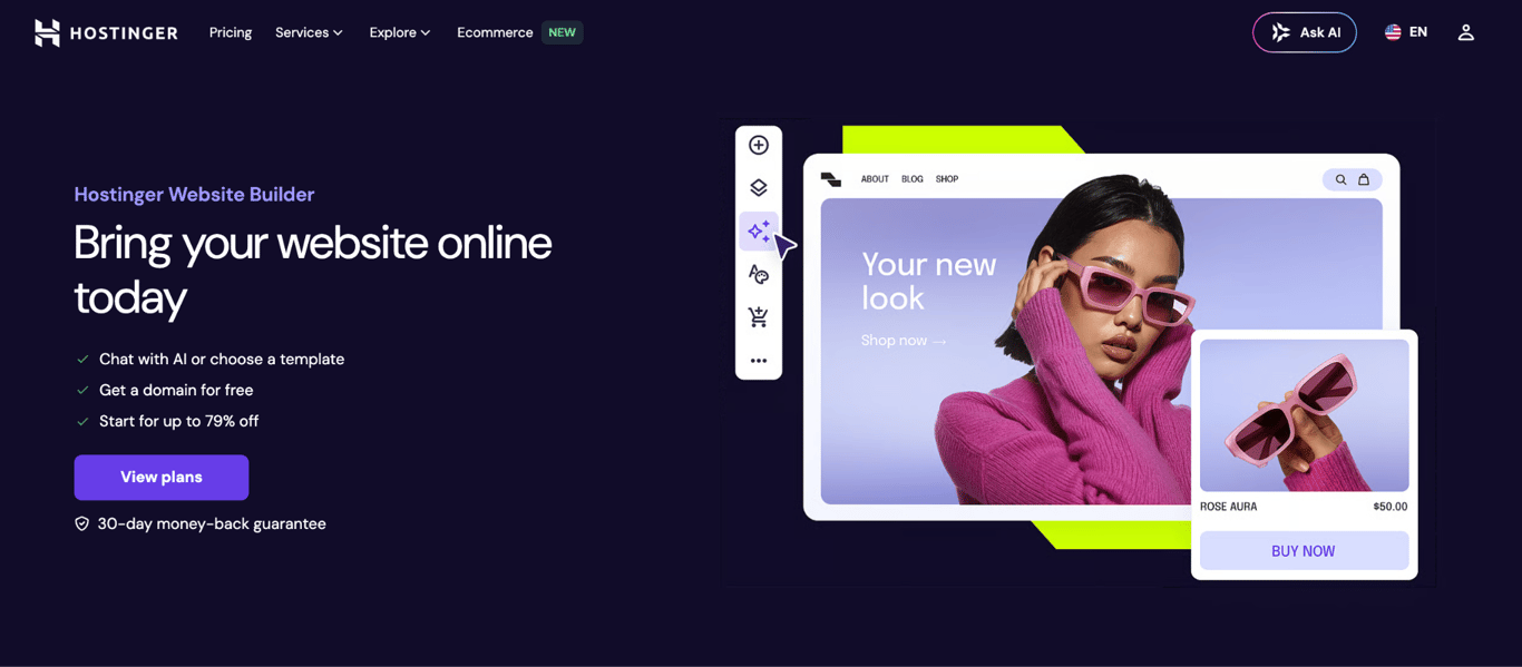
- Mobile editing: dedicated mobile editor with sidebar navigation, device preview, and direct publishing from a phone.
- AI tools: AI Website Builder, AI Writer, AI Logo Maker.
- Price: starting at CA$ 5.59/month (annual billing).
Hostinger Website Builder earns its place here because it combines AI-assisted setup, mobile-responsive templates, and a low starting price into a single platform. For users who want to build and maintain a simple site, it covers the essentials.
The Hostinger Website Builder includes a mobile editor that lets you edit text, reposition elements, upload images, manage navigation menus, preview changes across devices, and publish updates from a smartphone.
The sidebar layout keeps the editing tools accessible on the screen, minimizing the need to switch between tabs while working on small displays.
Three AI tools run inside the mobile editor:
- AI Website Builder. Describe your site in plain language, and the tool generates a full layout, including pages and content structure. It eliminates the blank-canvas problem that stalls most first-time builders.
- AI Writer. Generates SEO-optimized copy for blog posts, product descriptions, and meta titles from a prompt.
- AI Logo Maker. Helps create a logo from basic brand details.
The editor includes mobile-friendly templates and device preview. The AI website builder can automatically create the initial site structure if you’d rather not start from a template.
On the ecommerce side, Hostinger’s tools cover product listings, payment options, and checkout for small catalogs. It fits freelancers, small business owners, bloggers, and portfolio creators well: anyone who wants an affordable, AI-assisted builder they can set up and update from their phone.
Hostinger is less suited to complex, feature-heavy websites that need advanced custom logic, large app ecosystems, or highly detailed manual design control. For a full picture of what the editor can do, see the drag-and-drop website builder guide.
Hostinger Website Builder mobile features:
- Mobile editor with drag-and-drop layout, text editing, image uploads, and navigation management directly from a smartphone.
- AI Website Builder generates a site structure from a plain-language description.
- Device preview shows how your site looks on phones, tablets, and desktops before publishing.
- 300+ ready-to-use templates included across all plans.
- Ecommerce tools for small store setup: product pages, payments, and checkout.
- Free custom domain included on yearly plans.

2. Wix
- Best for: Mobile design control and app-based site management.
- Mobile editing: Wix app for day-to-day management; dedicated mobile editor in the browser for layout customization.
- AI tools: Wix AI Website Builder, AI content generator, AI Logo Maker.
- Price: free plan available; paid plans starting at $17/month (annual billing).
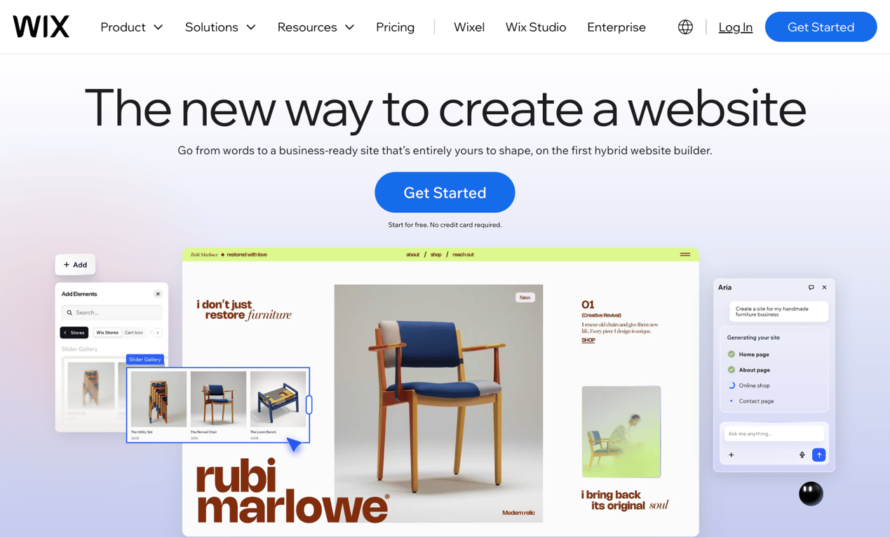
Wix gives you more mobile-specific control over how your site looks and functions. The combination of the Wix app, a separate mobile editor view, and Wix AI makes it a strong option for users who want to fine-tune both the desktop and mobile versions of their site from scratch.
The Wix app (iOS and Android) handles day-to-day management: publishing blog posts, uploading images, managing store orders, monitoring site analytics, and responding to contact form submissions.
Detailed design work is still easier in the browser editor, where users can adjust the mobile version separately from the desktop layout. This is useful when a page needs different spacing, a different section order, or different calls to action on mobile.
Wix’s AI Website Builder can generate a site from a prompt, creating a first draft with relevant sections and content. Once generated, users can refine the mobile layout. An AI content generator and AI logo maker are also built into the platform.
The tradeoff is that heavy customization can affect mobile performance. Testing your URL through Google PageSpeed Insights after major design changes is a practical habit.
Significant design work also remains more efficient in a desktop browser, which makes Wix the right fit for users who set up at a desk but update regularly from a phone and want more control over the mobile layout.
Wix mobile features:
- Mobile layout controls for adjusting the phone version of your site.
- Hide or show any element, reorder sections, and adjust tap-target spacing for mobile.
- Wix app for content publishing, store management, and analytics.
- Wix AI Website Builder generates a responsive site from a prompt.
- Extensive app market with 500+ integrations for forms, bookings, and marketing tools.
3. Squarespace
- Best for: premium responsive templates for portfolios, visual brands, and service businesses.
- Mobile editing: mobile app for content and store updates; Fluid Engine browser editor for mobile layout control.
- AI tools: Blueprint AI setup and AI writing features
- Price: 14-day free trial; paid plans start at $16/month (annual billing).
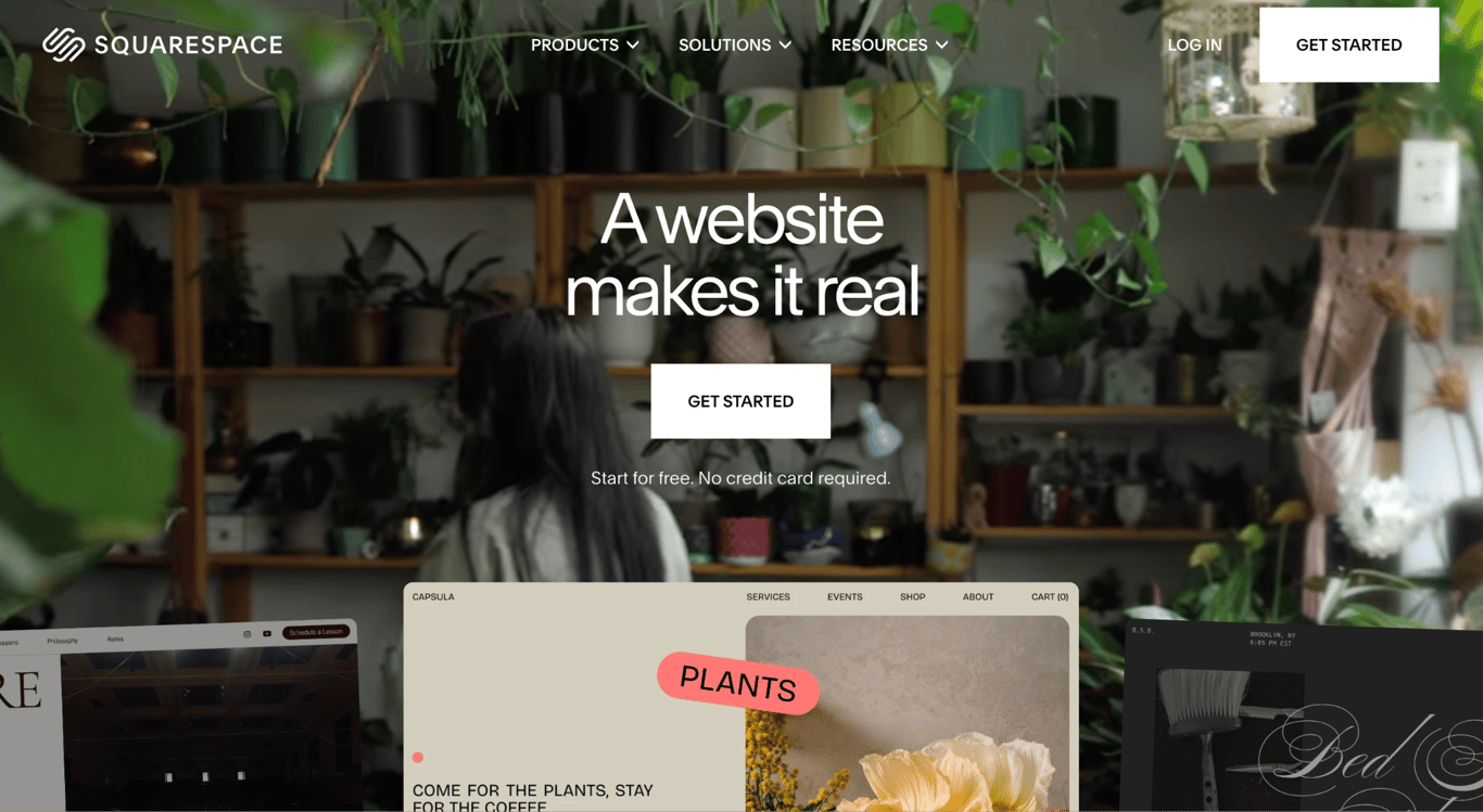
Squarespace doesn’t have the most extensive mobile editing toolkit, but it has polished, design-focused templates. Its templates are mobile-optimized, and the Fluid Engine layout editor introduced with Squarespace 7.1 gives users more layout control in the browser.
What you can do from the Squarespace mobile app: edit text, upload images, publish blog posts, manage store inventory, update page content, and view site analytics. Full layout design and advanced product editing are still easier from a computer.
The Fluid Engine editor, accessible in a desktop browser, lets you reposition, resize, and reorder blocks specifically for responsive layouts. This goes beyond automatic responsive scaling: you have direct control over how sections stack, what gets emphasized on small screens, and how elements are spaced for touch navigation. The Blueprint AI tool can generate an initial site structure from a prompt if you’re starting from scratch.
Squarespace works best for photographers, designers, agencies, consultants, and service businesses where visual presentation matters. The typical workflow is to publish content on the go and do actual design work at a desk.
For users who want to build an entire website from a phone, Squarespace is not the strongest choice. Its mobile app supports useful updates, but it does not replace the desktop design workflow.
Squarespace mobile features:
- Mobile-optimized templates with a polished visual design.
- Fluid Engine supports detailed layout control in the browser editor.
- Mobile app handles text edits, image uploads, blog publishing, and store inventory.
- Built-in image editor in the app for cropping and filtering before upload.
- Squarespace plans include hosting, SSL security, SEO tools, and 24/7 support.
4. Shopify

- Best for: mobile ecommerce management
- Mobile editing: Shopify mobile app with full store management and a mobile theme editor for layout adjustments.
- AI tools: Shopify Magic, Sidekick, and AI store builder.
- Price: Basic starts at $29/month (annual billing).
Shopify is not a general-purpose website builder: it’s an ecommerce platform, and its mobile app is built around running a store from your phone.
From the Shopify mobile app, you can manage products, inventory, orders, payments, shipping tasks, and store analytics.
The app also includes a mobile theme editor that lets you customize sections, move blocks, and adjust theme settings. For store owners who spend most of their time away from a desk, this level of mobile store control is Shopify’s clearest advantage.
Shopify offers free and paid responsive themes for online stores. Advanced CSS customization and custom theme development still require desktop access. It also includes AI-assisted tools, including Shopify Magic, Sidekick, and an AI Store Builder, but these tools are designed for ecommerce rather than general website creation.
Shopify’s pricing is structured for commerce. Its Basic plan is the entry point for a full storefront, and the feature set is built around selling products, managing orders, and supporting checkout.
It may not be the best choice tool for portfolios, blogs, or non-store business sites. Also, if you’re building a business site with a small product catalog, a general website builder with ecommerce features may be simpler and more cost-efficient.
Shopify mobile features:
- Mobile app covers product management, order fulfillment, inventory, and store analytics.
- Mobile theme editor for customizing sections and making layout changes.
- Supports selling online, through social channels, and in person with point-of-sale tools.
- Hundreds of mobile-responsive themes.
- Payment tracking and order notifications from the app.
5. SimDif
- Best for: building a complete website from a phone.
- Mobile editing: native iOS and Android app with the full feature set of the desktop browser version.
- AI tools: Kai AI assistant and Optimization Assistant.
- Price: free Starter plan available. Paid plans starting at $7.08/month (Smart plan, global standard price, annual).
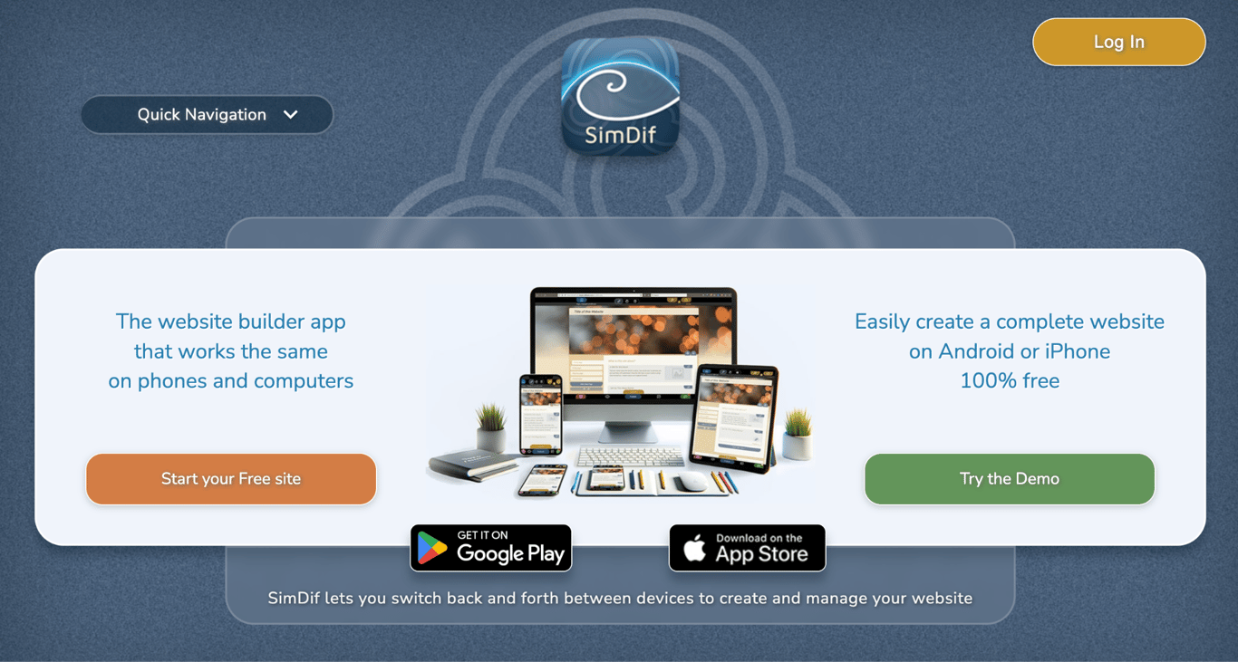
SimDif is the only website builder in this list designed from the start for phone-based creation. While other platforms have added mobile apps and mobile editors over time, SimDif launched as a mobile-first tool and has built its editing experience around what works on a phone screen.
The SimDif app lets you create pages, organize content blocks, customize themes, manage navigation, publish updates, and review visitor statistics from your phone.
Kai, an AI-powered advisor, helps users develop ideas and improve their site step by step, while the Optimization Assistant points out improvements before publishing.
SimDif uses a structured block-based approach that works well on a small screen. However, it limits layout freedom compared to freeform builders like Wix or Framer, and the theme selection is smaller than Squarespace’s.
That structure suits small business owners, freelancers, teachers, and community organizations who want a clean site without design complexity.
The free Starter plan supports up to 5 pages on a .simdif.com subdomain. Smart supports up to 12 pages, while Pro supports up to 30 pages and adds more advanced customization and ecommerce options through integrations such as Ecwid or Sellfy. SimDif uses its FairDif pricing model, which adjusts pricing based on the local cost of living. However, global standard prices are $8.50/month for Smart and $16.60/month for Pro.
SimDif mobile features:
- Mobile website creation and editing, including pages, blocks, themes, and navigation.
- Cross-device editing across phone, tablet, and computer.
- Block-based editor optimized for touch navigation.
- Optimization Assistant highlights improvements before publishing.
- PageOptimizer Pro (POP) integration for advanced SEO keyword analysis (paid plans).
6. Carrd
- Best for: one-page sites, link-in-bio pages.
- Mobile editing: browser-based only; no native mobile app. Sites are fully responsive.
- AI tools: none built in.
- Price: free plan available; Pro plans starting at $9/year.
Carrd is built for responsive one-page websites. Link-in-bio pages, landing pages, personal profile pages, and simple portfolios work well on Carrd because the platform focuses on a single-page format.
Carrd has no native iOS or Android app. You can open the editor in a mobile browser, but it is better suited to desktop or larger-screen editing. The published sites are responsive, load fast, and look clean across all screen sizes.
A free Carrd account lets you build and publish a one-page site with no expiry, though it runs on a .carrd.co subdomain and includes Carrd branding.
The paid Pro plans are annual: Pro Lite at $9/year, Pro Standard at $19/year, and Pro Plus at $49/year. Pro Lite supports up to three sites, Pro Standard supports up to 10 sites, and Pro Plus supports up to 25 sites.
Carrd’s limitations are by design: there’s no blog engine, no multi-page navigation, and no native ecommerce beyond embedding a payment button. It’s a good choice for creators who need a clean single-page presence, whether that’s a link-in-bio page, a coming-soon page, or a lightweight landing page. Anyone who expects their site to grow beyond one page should consider a different tool.
Carrd mobile features:
- One-page sites optimized for mobile viewing.
- Responsive output by default.
- Simple setup and publishing for lightweight pages.
- Lower annual cost than most subscription-based builders.
7. Framer
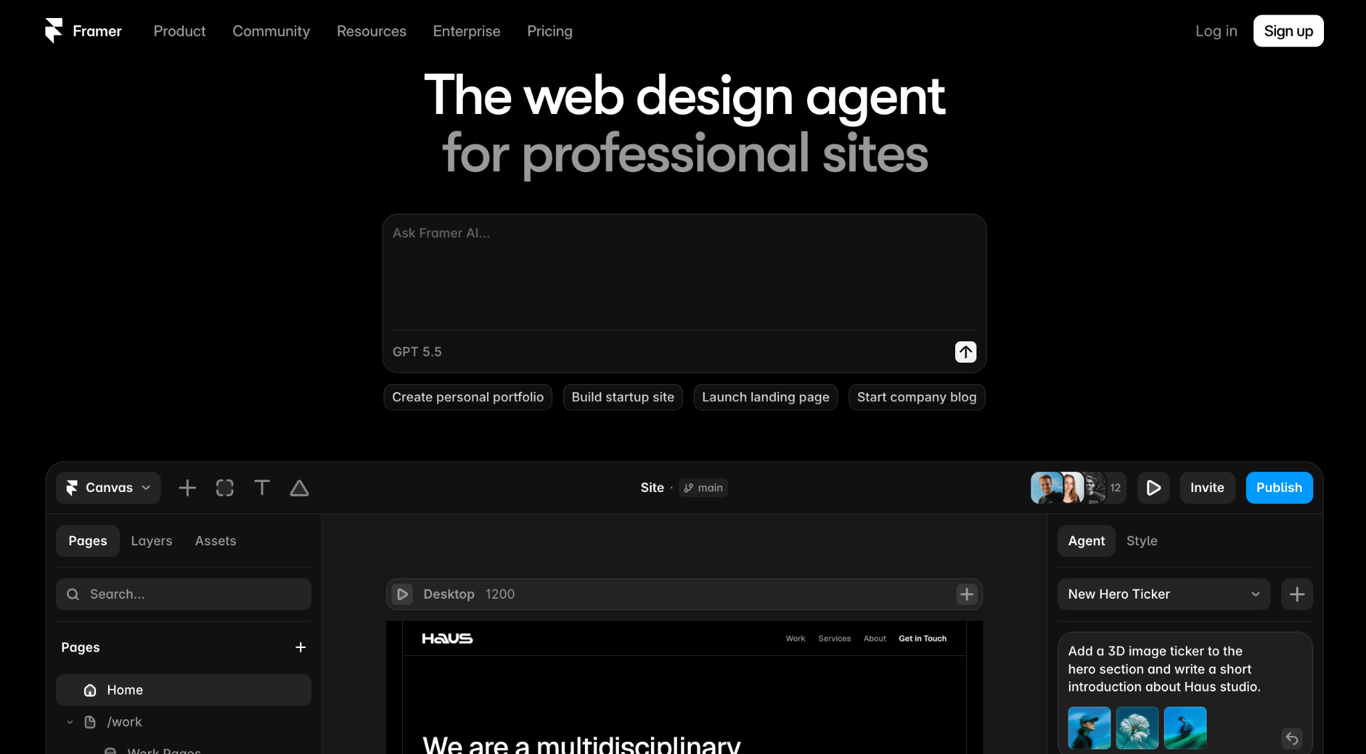
- Best for: modern, design-forward responsive landing pages and marketing sites.
- Mobile editing: no mobile app; desktop editor with responsive breakpoint control.
- AI tools: Framer AI agent and AI Wireframer workflow for AI-powered website design
- Price: free plan available; paid plans starting at $10/month (annual billing).
Framer is a design-forward tool. Startups, agencies, and design-led brands use it for polished marketing sites, interactive landing pages, and portfolio work that requires animation, custom breakpoints, and precise visual control.
Framer is not practical for phone-first editing. It has no native mobile app, and the browser-based editor is best for mouse-and-keyboard input.
Framer’s strength is responsive breakpoint control. You can define how your site adapts across screen widths, and Framer renders it correctly on every device.
In terms of AI tools, Framer’s AI workflow can generate page layouts from prompts and assist with coding components. These tools are built for the desktop editor, so you may have to use a PC
Framer has no native ecommerce system. Selling through a Framer site requires a third-party integration (Shopify Buy Button, Stripe, or similar), which adds setup time and ongoing cost.
The free plan limits your site to a .framer.website subdomain; a custom domain requires a paid plan. Framer Basic starts at $10/month (annual billing) with 1,000 credits/month and 50 GB bandwidth. The Pro plan at $30/month (annual billing) includes 3,000 credits/month and 100GB of bandwidth, plus staging, more CMS collections, and additional pages.
The learning curve is also steeper than other simpler builders. It is best for designers, startups, and marketing teams that work primarily on desktop. It’s not the best choice for anyone who needs to build or edit exclusively from a phone.
Framer mobile features:
- Responsive breakpoint control for direct phone, tablet, and desktop layouts.
- Responsive sites that can perform well when assets, animation, and scripts are kept lightweight.
- Animation and interaction design built into the editor.
- CMS and staging on Pro plan for content-driven marketing sites.
8. WordPress.com
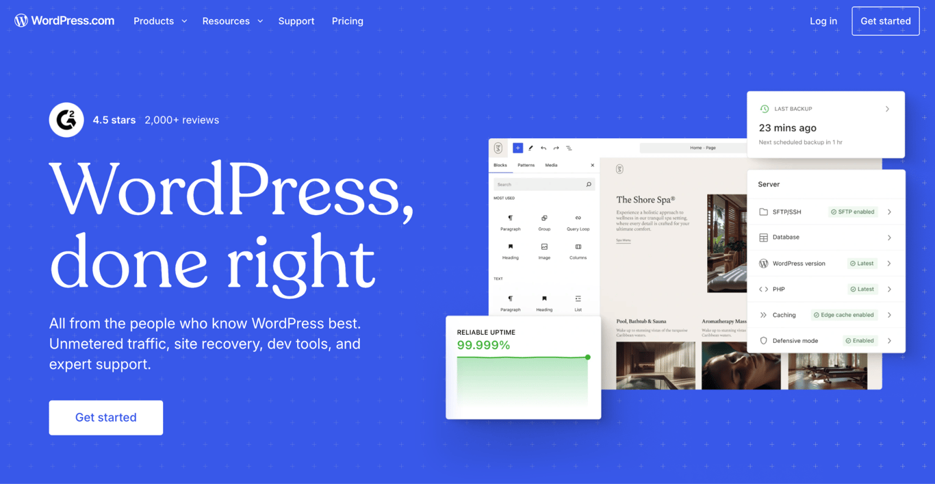
- Best for: mobile blogging and regular content publishing.
- Mobile editing: WordPress mobile app for writing, post editing, and publishing.
- AI tools: WordPress AI Assistant and AI website builder.
- Price: free version available; paid plans starting at $4/month (annual billing).
WordPress.com is a strong choice for bloggers, journalists, newsletter writers, and content creators who publish regularly on the go and want managed hosting without the need for server administration.
. From the WordPress mobile app, you can write and format posts, edit existing pages, moderate comments, publish drafts, schedule content, and check basic site analytics.
The block editor in the app supports most standard content types, including images, video embeds, and formatted text. Theme and plugin management, advanced layout work, and custom CSS still require a desktop browser and, for most features, a paid plan.
WordPress.com templates are responsive, and the platform gives content publishers built-in tools for posts, pages, media, comments, and analytics.
The free plan is limited, with a WordPress.com subdomain, no custom domain, and 1 GB of storage) Users who want a professional site usually start with the Personal ($4/month, annual billing) or Premium ($8/month, annual billing) plans.
Advanced plugins, ecommerce features, and deep customization are tied to higher-tier plans: the Business plan at $25/month (annual), and full WooCommerce support on the Commerce plan at $45/month (annual).
For context on the difference between WordPress.com and self-hosted WordPress, the WordPress.com vs WordPress.org comparison covers what you gain and give up on each path.
WordPress.com mobile features:
- Mobile app for writing, formatting, scheduling, and publishing content.
- Comment moderation and basic traffic analytics from the app.
- Block editor supports images, embeds, galleries, and formatted text.
- Responsive themes and publishing tools for content-first websites.
9. SITE123
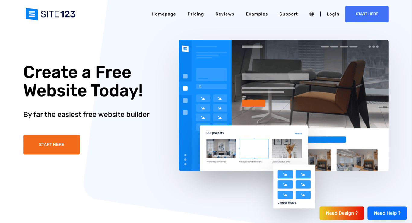
- Best for: quick guided setup for first-time site owners and small-business sites.
- Mobile editing: browser-based with built-in device preview; mobile-responsive output.
- AI tools: text generation tools.
- Price: free version available; paid plans starting at $10.80/month (annual billing).
SITE123 helps first-time users create a basic responsive website with minimal design decisions. The setup wizard generates a ready-made layout from a short questionnaire, and the section-based editor lets you swap content, adjust colors, and preview the result across device sizes.
The browser-based editor can be used on mobile, but it is easier on a larger screen. SITE123 creates responsive pages automatically and provides a preview tool for checking how the site appears across devices
SEO basics (editable meta tags, automatic sitemaps, 301 redirects, and analytics integration) are included on all plans.
The section-based structure means you work within predefined content blocks rather than moving elements freely around the page. For first-time site owners, hobbyists, and small business owners who just need a clean, functional site, this structure keeps the process fast.
The variety of templates is smaller than Wix or Squarespace, and anyone who expects to grow into a more visually distinctive site will eventually need a different platform. Ecommerce tools (product listings, inventory management, payment gateway integration) are available on paid plans.
SITE123 mobile features:
- Guided setup for creating a basic site structure
- Section-based editor with device preview.
- Responsive templates for phone, tablet, and desktop display.
- SEO tools and analytics integration.
- Multilingual website support.
10. Weebly
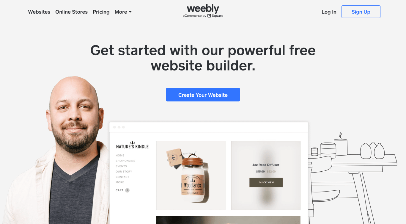
- Best for: basic mobile site and store management.
- Mobile editing: The Weebly mobile app was discontinued; editing requires a web browser.
- AI tools: none.
- Price: free version available; paid plans starting at $13/month (annual billing).
While Weebly is known for pioneering mobile app and touchscreen drag-and-drop editor, the dedicated mobile editor has been officially discontinued. Users now have to manage layouts through a web browser, though basic storefront tasks and inventory sync can still be handled on phones via the Square POS app.
Weebly remains useful for basic websites, but it is not as competitive as newer builders for AI-assisted setup, flexible mobile editing, or modern design control
. Pricing starts at $13/month on annual billing for the Personal Plan, and it lets users connect a custom domain. The Professional plan at $15/month on annual billing adds more customization, and the Performance plan at $32/month on annual billing adds growth and ecommerce management features.
The free plan works for basic use, but users who need a custom domain, fewer branding limitations, or stronger ecommerce features will need a paid plan. Weebly’s main appeal is simplicity rather than advanced design or AI functionality.
Existing Weebly users may find it familiar and practical. New users should compare it carefully against other alternatives before choosing it for a new site.
Weebly mobile features:
- Touch-optimized mobile browser for arranging text, images, and content blocks.
- Responsive templates for mobile-friendly display.
- Basic ecommerce management (products, orders, analytics) from the app.
- Free plan available for basic use.
11. GoDaddy
- Best for: fast local business setup.
- Mobile editing: GoDaddy mobile app with section-based editing, image uploads, and business management tools.
- AI tools: Airo AI for site, branding, and business setup support
- Price: starting at $9.99/month (annual billing).
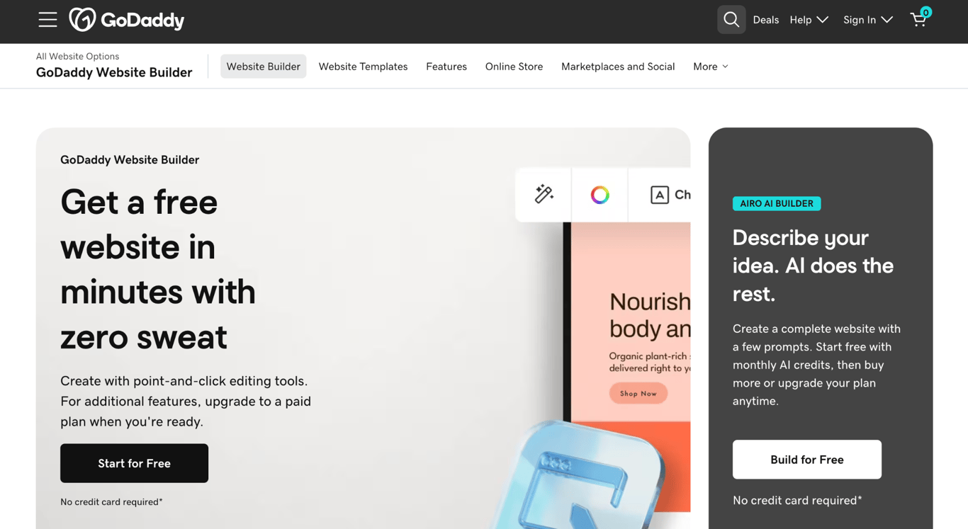
GoDaddy’s website builder prioritizes setup speed: the Airo AI tool can create a website from prompts, and the GoDaddy mobile app lets you maintain and update it on a phone.
From the app, you can edit page content, upload images directly from your camera roll, manage appointments, process store orders, and email marketing campaigns. The section-based editor means you work within predefined content areas rather than using a freeform drag-and-drop design canvas.
The Basic plan at $9.99/month on an annual billing is better for a simple local business website. Ecommerce users should consider the Managed Ecommerce for WordPress at $20.99/month on an annual billing. It includes premium WooCommerce extensions for processing payments, customizing carts, and showcasing products.
Design flexibility is GoDaddy’s main constraint: its templates and editor give you less control over layout than Wix, Framer, or Squarespace. Users who want a visually distinctive site may outgrow the design system quickly. Domain renewal prices also increase after the first year, which is worth factoring into a multi-year budget.
GoDaddy is a good fit for local businesses, service providers, and first-time site owners who need a functional site to go live quickly. The appointment and payments tools make it practical for service businesses that manage bookings from a phone.
GoDaddy mobile features:
- Airo AI generates a ready-to-edit site layout from a few business details.
- Mobile app for page editing, camera roll uploads, appointment management, and order processing.
- Section-based editor optimized for fast content updates.
- GoDaddy Payments for in-person and online transactions.
- Appointment and recurring booking tools.
How to choose the right mobile website builder
The right choice comes down to two things: how you plan to use the builder (building from a phone, managing from a phone, or both), and what kind of site you’re creating.
The basics of how to choose a website builder still apply: pricing models, design flexibility, ecommerce features, and growth options. For mobile use, focus on the questions below.
Are you building the whole website from your phone or only editing it later?
These are different workflows that need different tools. Match yours to the right group:
- Building entirely from a phone: SimDif. Its iOS and Android apps deliver the same full editing capabilities as the desktop version.
- Desktop setup, mobile management: Hostinger, Wix, WordPress.com, Squarespace, and Shopify. All handle publishing, store management, and content updates well from a phone, but the initial build is faster on a desktop.
- Desktop-only building: Framer and Carrd. They are better for desktop or larger-screen editing than phone-first creation.
💡 Pro tip
If you want to build from start to finish on a phone, SimDif and Hostinger's mobile editor are the two clearest starting points.
Do you need a dedicated mobile editor or responsive templates?
Responsive templates automatically adjust content to fit smaller screens. A dedicated mobile editor goes further by letting you control the phone version more directly, such as adjusting spacing, section order, visibility, or mobile-specific calls to action.
- Wix is a strong option if you need a dedicated mobile editor.
- Squarespace’s Fluid Engine offers block-level control in the browser editor.
- Hostinger is useful if you want AI-assisted setup, responsive templates, and device preview without a complex design workflow.
If layout consistency across devices is enough, responsive templates are sufficient. If you want to actively design for a mobile audience, prioritize a dedicated mobile editor. If you’d rather skip most layout decisions entirely, AI tools to build a website can generate a starting structure for you.
Are you creating an online store?
Shopify is a strong choice for mobile ecommerce management, but the right fit depends on your store’s scale. The decision affects everything that follows when you make an ecommerce website, from catalog structure to checkout flow.
Whichever builder you pick, mobile commerce fundamentals such as checkout speed, one-tap payment options, and touch-optimized product pages matter as much as the platform itself.
- Shopify: best for full ecommerce management. Adding products, fulfilling orders, updating inventory, and tracking revenue from a phone all work well here.
- Hostinger Website Builder: the practical choice for small stores on a budget. Product listings, checkout, and basic inventory at a lower entry price compared to Shopify.
- Wix and Squarespace: both support ecommerce manageable from mobile, but neither matches Shopify’s depth for high-volume stores.
Do you need a one-page site, portfolio, blog, or business website?
Match the site type to the tool:
- One-page sites and link-in-bio pages: Carrd. Fast setup, low annual cost, fully responsive output.
- Modern landing pages for startups and agencies: Framer. It offers strong responsive design control, but it is desktop-first.
- Portfolios and visual brands: Squarespace is strong for polished templates. To make an online portfolio that stands on its own design-wise, Squarespace or Hostinger both give you enough control without overcomplicating the process.
- Blogs and content-first sites: WordPress.com. Its mobile writing and publishing workflow makes it a strong choice for regular content creators.
- Local business and service sites: GoDaddy or SITE123. Both offer fast setup and simple business pages with minimal design decisions.
- All-in-one affordable option: Hostinger Website Builder. It covers most of these use cases on a single plan with AI-assisted setup and a functional mobile editor.
What should you test before publishing?
A site that looks good in the builder preview doesn’t always perform well on a real phone. Before publishing, test usability, forms, checkout, layout, and website performance.
Go through each of these before you publish:
- Navigation: tap through every menu item on a physical device. Confirm that the dropdown menus open correctly and that all links resolve.
- Tap targets: buttons and links should be large enough to tap without zooming. Google’s guidance is a minimum of 48 × 48 pixels per target.
- Forms: complete any contact forms or lead-capture fields on a phone. Confirm the keyboard doesn’t obscure input fields.
- Checkout (if applicable): run a complete test transaction from product page through confirmation on a real phone. Verify payment loads correctly.
- Image scaling: check that images don’t overflow containers or appear pixelated on high-resolution screens.
- Page speed: run your URL through Google PageSpeed Insights on the mobile setting. Treat low scores as a warning to review image size, scripts, apps, and third-party embeds.
- Core Web Vitals: Check Largest Contentful Paint (LCP), Cumulative Layout Shift (CLS), and Interaction to Next Paint (INP). These metrics help identify slow loading, visual instability, and interaction delays on mobile.
- Real-device testing: the builder’s mobile preview is a starting point, not a final check. Load your published URL on at least one iPhone and one Android device before launch.
How to build and launch your mobile-friendly website
Once you’ve picked your platform, build the structure first: set up your main pages (home, about, contact, and services or products), add your branding (logo, color palette, fonts), and fill in the navigation. Do this before touching visual polish. A clear, functional structure is easier to refine than a visually detailed site with content gaps.
Write for mobile readers from the start. Shorter paragraphs, clear headings, and a single call to action per page work better on small screens than dense blocks of text. If you’re using an AI writing tool like Hostinger’s AI Writer, Wix’s content generator, or WordPress.com’s AI Assistant, treat the output as a first draft to edit rather than a finished product.
For stores, add your products, configure at least one payment method, set up shipping zones if you sell physical goods, and run a test order before going live. A checkout that breaks on a phone can stop customers from buying.
Connect a custom domain before publishing. Most builders in this list include a free domain for the first year on annual plans. Using yoursite.com rather than yoursite.builder.com can affect both search visibility and first impressions.
Hostinger Website Builder handles all of this from a single dashboard. You can create a website with your phone from setup through publishing. The AI Website Builder generates the initial structure, AI Writer populates the content, and the mobile editor handles any refinements before you go live.
Once the site is ready, run through the testing checklist in the previous section, then work through the website launch checklist to verify domain configuration, SSL, SEO settings, and mobile display before your site goes public.


Auksė Žirgulė is the Head of Website Builder at Hostinger, where she focuses on creating real value for customers. With a career that started in QA, her journey into product management broadened her perspective and deepened her understanding of what it takes to build a successful product. Auksė is known for her energetic approach and a passion for leading teams to achieve impressive growth. Follow her on LinkedIn.